Unga Klara 10 Years Celebration
2015–2025! We celebrate ten years of collaboration with Unga Klara – and are looking forward to many years to come!
Unga Klara is one of Sweden’s national stages and a world-leading theatre for children and youth.


Studio Parasto Backman is an award winning Stockholm based design studio established in 2010. We specialize in printed matters, visual identities and visual storytelling – collaborating with clients of all sizes and industries. We maintain an intentionally diverse practice which we believe is important for the diversity of expressions. More info here


2015–2025! We celebrate ten years of collaboration with Unga Klara – and are looking forward to many years to come!
Unga Klara is one of Sweden’s national stages and a world-leading theatre for children and youth.


Visual identity for the exhibition Låt hundra blommor blomma / Let a Hundred Flowers Bloom at Röhsska Museum. We have delved into Elsa Pärs-Berglund’s (1920–2005) artistry/archival material and interpreted her textile works.
The bespoke tyeface used in the title and some of the flowers are created based on a modular system inspired by Pärs-Berglsund’s archive material. The remaining flowers are created from a Persian miniature art tradition. We also wanted to break the white scenographic cube shape by using an organic wave shape taken from one of Pärs-Berglund’s textiles.
Elsa Pärs-Berglunds was deeply involved in the big issues of her time and she portrayed political events, global injustices, environmental issues and the Swedish labor movement.
In several of the works in the exhibition, the flower figures as a political symbol of justice and resistance – both in the form of the red rose of the labor movement and the flower as a symbol of environmental law. But the exhibition also reflects on Pärs-Berglund’s political contemporaries, and the idealizing personality cult of socialism and communism.
The exhibition also shows works by Shabnam Faraee and Josefine Gäfvert – plus installations by Marcia Harvey.
Winner of The Kolla! Award
(Photo Kristin Lidell, Röhsska)


A selection of books that we have designed lately for Brombergs Publishing House, Wahlström & Widstrand Publishing House and Resonate Edition Publishing House.
As part of Type Directors Club’s advisory board, Marta Cerdà Alimbau and I had the privilege to both organize and craft the identity for Ascenders 2024, the award for typographic creatives aged 35 or under. A comprehensive project encompassing every aspect from inception to completion: from curating the jury and designing the award to moderating events and crafting a unique design identity.
The design theme for Ascenders 2024; “ascending”, symbolizes the journey of climbing the ladder towards innovation, creative expansion, and the future of typography. To embody this concept, we’ve chosen the Air typeface from Pangram Pangram for all textual elements, aligning with the theme’s essence of upward movement and growth.
A meticulously selected, diverse jury of 17 professionals from across the globe was set to judge Ascenders 2024. This selection underscores our community’s heterogeneous evolution.
Co created with Marta Cerdà Alimbau


Happy to have designed this year’s book for Svensk Bokkonst/Swedish Book Award.
The graphic design is a tribute to book art and to the ornament’s given place in a contemporary context. Based on specific historical books from The Royal Library’s archive, we have been inspired by how they back in the days used the front cut in a tactile and artistic way – focusing on ways to bring the craft into a present context.
Awarded at the AWDA Award for the Best Communication Project, and Nominated for the Kolla! Award.


Artwork for Vad jag pratar om när jag pratar om Rasism / What I Talk About When I Talk About Racism (english translation). By Seher Yilmaz.
Through a personal lens Seher situates racism in Sweden. Among other things she discusses class, discrimination, alienation, language and meritocracy.
Client: the publishing house Natur och Kultur


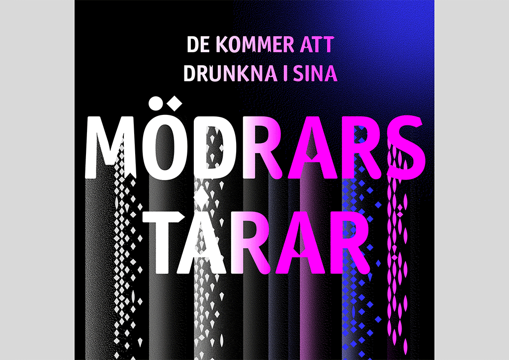
The theater performance De kommer att drunkna i sina mödrars tårar (They Will Drown in Their Mothers Tears) is a science fiction thriller about hope and hopelessness in today’s Europe, about friendship and betrayal, and about the theater of terror
and fascism.
The publication and visual identity intends to reflect a spectrum through color and form, through complexity, transitions and parallel worlds. Poetry runs throughout the publication, designed in different fonts by type-designers with roots in parts of the world which is not dominated by whiteness. A visual interpretation of an amazing theatrical performance – directed by Farnaz Arbabi, after a book by Johannes Anyuru.
A collaboration between Unga Klara and Uppsala stadsteater.
The publication was awarded for Swedish Book Award (Svensk bokkonst).


We have designed three books by the author Angie Thomas, in Swedish translation. The books have a clear connection to each other but are also individual stories.
The Hate You Give was the first book to be published and has become a modern classic about racism in the United States. The BLM movement plays a central role.
Min Tur Nu is a tribute to Hip Hop music/culture.
Betongrosor is about the father of the main character in The Hate You Give.


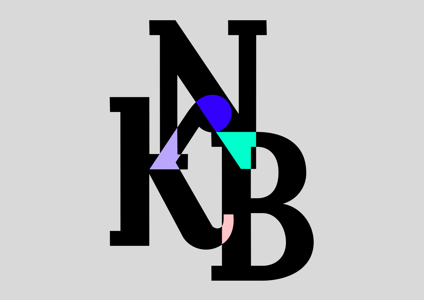


New visual identity for Nya Kompisbyrån (NKB). NKB’s activities enable integration through meetings of various kinds, and this is the starting point for the new visual identity. In other words, the shapes reflects meetings.
NKB’s activities enable integration through meetings of various kinds, which is the starting point for the new visual identity. Instead of showing physical people who meet, we have chosen to work with graphic shapes that represent the meeting. These shapes are inspired by Nya Kompisbyrån’s activities, areas such as sports, dinner-meetings, have a coffee together etc. We have, for example, taken shapes from cakes and sweets from Sweden but also from other parts of the world. Then we let these shapes meet and highlight/mark the areas where they merge. These imaginative shapes are then mixed with more abstract formations. The NKB logo also reflect meetings. The symbol highlights/marks the areas where the letters meet, the marking becomes the dot above the letter Å. A visual interpretation of Nya Kompisbyrån.


The publication NormViz is the result of a collaboration between Rise, Chalmers, White, Skanska and Visual Arena –
which together developed tools for broadening visualization within architecture and cityplaning, based on questions
such as: Who is the city for? Who is portrated? Whose everyday life is visible?
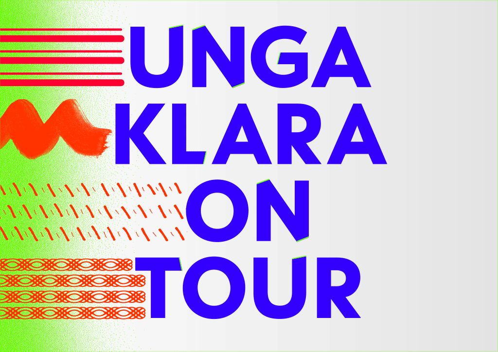


Unga Klara is out on their first national and world tour – UNGA KLARA ON TOUR
We have created 40 different symbols/ornaments/patterns that are combined in different ways and together form a rich graphic bank that shows Unga Klara’s width and the desire to communicate to many different people, beyond homogeneity.
The Visual Identity is an extension of Unga Klara’s activities as well as the permanent visual identity. It symbolizes stardust, speed lines and eclectic tracks that the theater leaves behind in the places they visit. Unga Klara is on its way out into the world in different forms and directions.


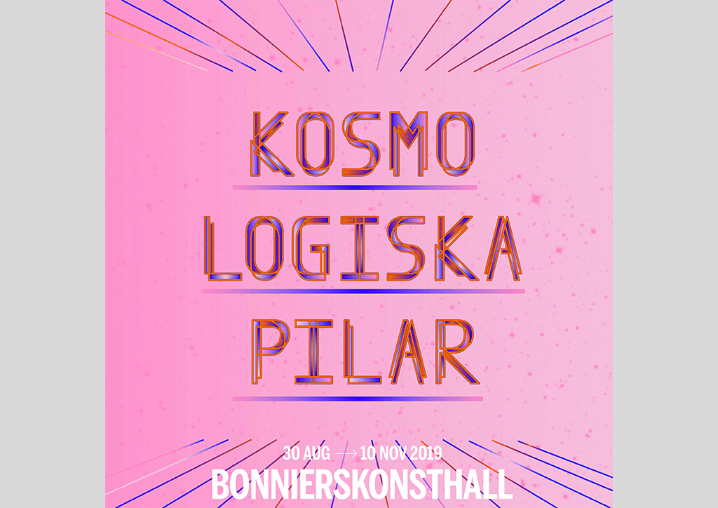
The exhibition Cosmological Arrows (Kosmopoliska Pilar) brings together thirteen contemporary artists who use science fiction and space to ask central questions about human existence and how we treat the world we live in. The artworks highlight ideas and visions that move freely between subjects such as astronomy, the environment, genus, colonization, futurism and artificial intelligence.
Client: Bonniers konsthall


Stockholm Museum of Women’s History (Stockholms Kvinnohistoriska Museum) is a new and groundbreaking museum dedicated to women’s history.
Posters and art work is created for the opening month.


Publication for the feminist glas group BOOM!
Comics by Emma Rendel.
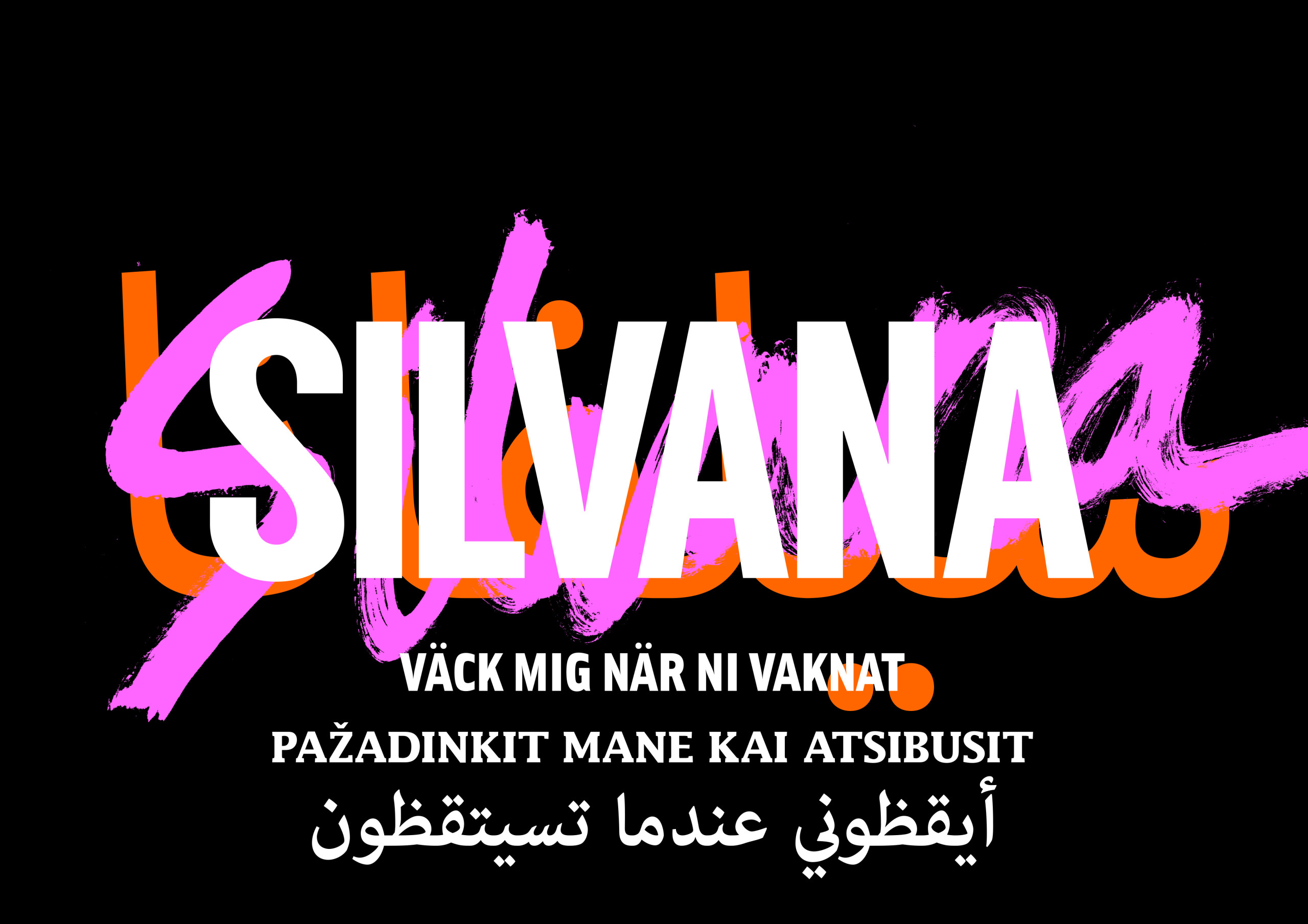


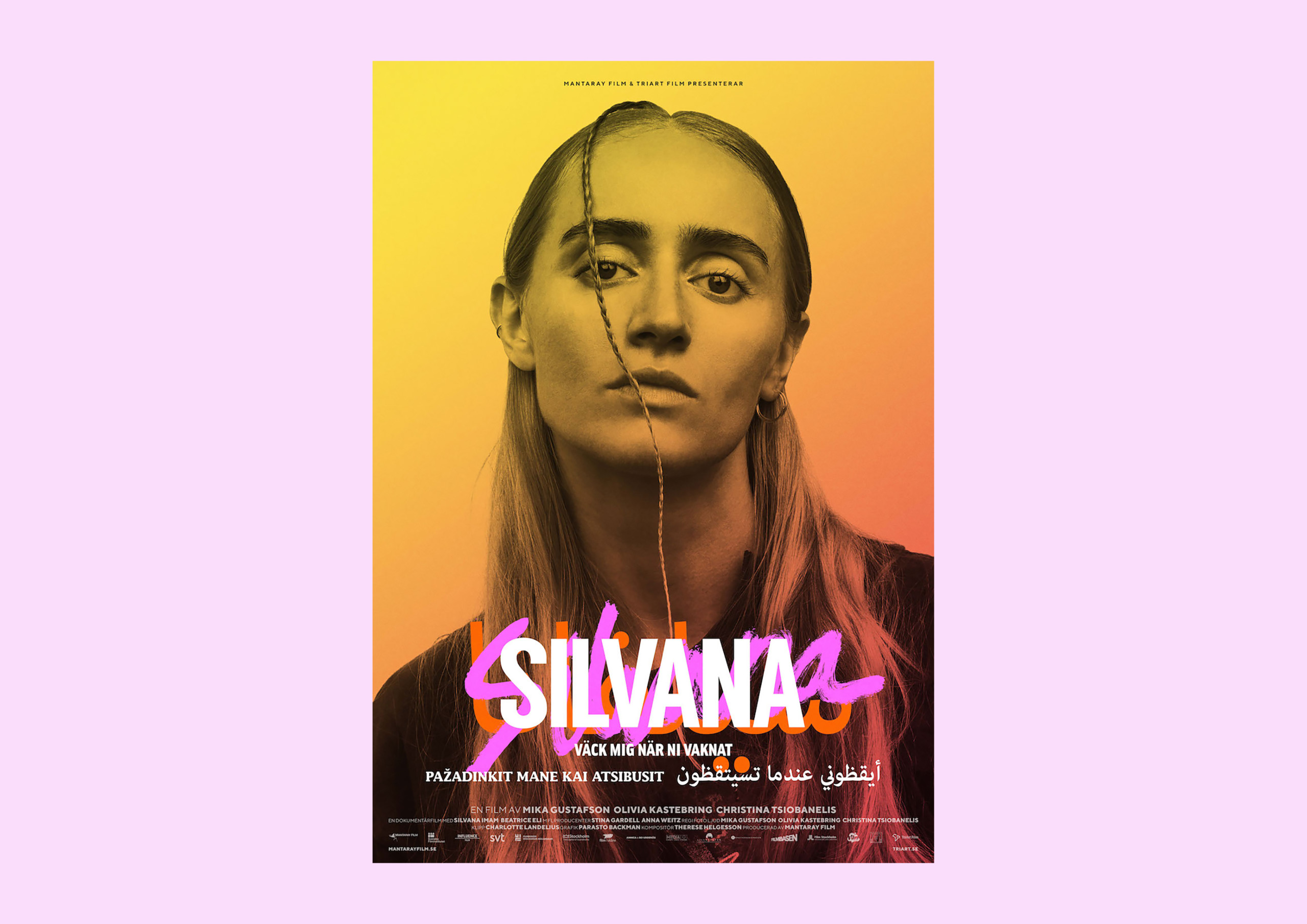

Film graphics for the movie about Silvana Imam. Directed By Mika Gustafson, Olivia Kastebring and Christina Tsiobanelis. Produced by Mantaray Film.


Book design for Kärleken & hatet (Love & Hate).
Written by Mara Lee.
Book design for Natten som föregick denna dag (The night prior to this day).
Written by Johanne Lykke Holm.
Book design for Det som inte kan utplånas.
Written by Felicia Mulinari.
Published by Albert Bonniers Förlag.


Book design for En annan historia (Another Story). Containing stories that was left out of the history books. In collaboration with Hanne Lindberg.
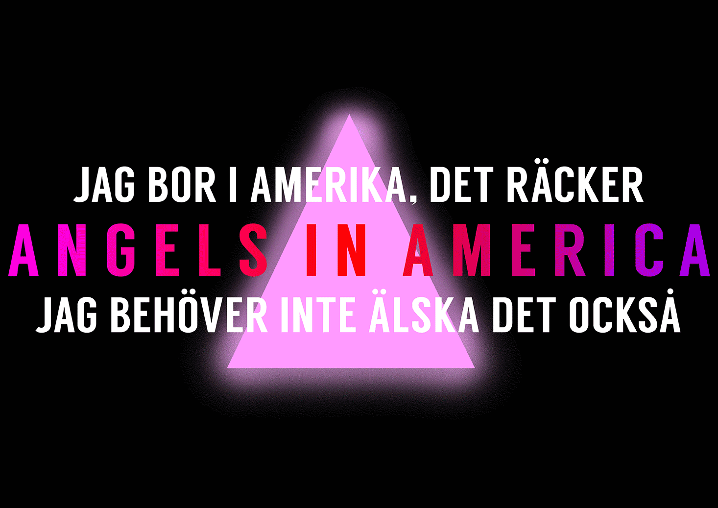
Visual Identity for the play Angels In America at Dramaten. Directed by Farnaz Arbabi.

Four books for Novellix – on the subject “To Flee”.
The stories are told by four different voices and four generations of migration.
Ania Monahof, David Mohseni, Zulmir Bečević and Marjaneh Bakhtiar.
The Swedish titles are typed with the font Albertus, created by German typographer
Berthold Wolpe who fled Nazi Germany in World War II. Wolfe drew the font during
his time in exile in Britain.
The Author’s names are typed with the font Common Sans, a specially designed
typeface with built-in featured automatically replaces the word “Refugee” with “Human”.

Poster for the Womens March.
Client: Swedish party Feministiskt initiativ (Feminist Initiative).


Cover art for Illustratörscentrum’s annual catalogue – representing Graphic Designers
and Illustrators.
“Since graphic design and illustration are separate subjects, our starting point has
been to find a concept that combines them both. We have chosen to work with the Initial
as a graphic team.
The initial is an enlarged and often reworked and ornate first letter in a text. The mill was built in the 600’s, and during the Middle Ages the handwriters’ initials could occupy a whole book page – which is in line with the studio’s idea of graphic design as a content carrier.”


Revy is a literary magazine that tackle the world’s best literature. This is the first issue.
The basic idea is to use one book as a prism to discuss different topics. First out is Jazz by Toni Morrison.
We have looked back on book design during a period of time when books were enhanced and was inspired by how form & content integrates, with a contemporary interpretation.
Each issue has a customized typography in the header as well as pointers & ornaments,
based on the theme of the book. In this issue we have looked in to harlem renaissance.
Publisher Natur & Kultur.


Studio Parasto Backman has designed the new price for the Guldbagge Award (Sweden’s national film award).
The purpose of the price is ” to inspire and encourage new, bold and creative choices in the film industry”.
The shape of the statuette reflects a transformation between the given and the groundbreaking. The work will inspire innovative choices and encourage norm creativity. The statuette glows in the dark and the colors vary each year!


Book design for the book Svart kvinna (Black women). About racism against black women in Sweden.
Published by Natur & Kultur.


Visual identity and a catalogue for the dance performance Jean. The show touches on subjects such as deconstruction of masculinity, power, klass and gender. In collaboration with Dansnät Sverige and Dansens hus.
The publication Jean won gold at Kolla! grafisk design och illustration award.

Art work and a publication for Jubileumsparken, Frihamnen and Gothenburg City Planning Authority. Jubileumsparken is an ongoing project and a part of Gothenburg’s 400th anniversary celebrations. Work in progress – more to come.


New Visual Identity for Unga Klara, a norm critical theatre that focuses on the child´s perspective.
The Identity won gold at Design S, Sweden’s National Design Award.


Art work for the play Vitsvit at Unga Klara.
Written by Athena Farrokhzad, directed by Farnaz Arbabi.


Visual Identity for the play Girls Will Make You Blush on the topic girls puberty.
Directors: Gustaf Deinoff and Mari Carrasco


Magazine for the creative platform Subtopia.
Photo: Märta Thisner. Illustration: Stina Löfgren.
In collaboration with Bergen.


Art work for the play X, facing the history of rasicm in Sweden.
Premiere March 7th 2015 at Unga Klara.
Director: Farnaz Arbabi


Visual identity for Europa Europa, a cabaret about European migration politics.
Initiated by the art group Ful and The Knife.
In collaboration with Bergen.


Chorin is a collection of hand-tufted wool rugs and a collaboration between Studio Parasto Backman and Studio Greiling.
The first collection focuses on the perception of perspective, subtly translated onto a flat surface. The designs are applied onto three different sizes, each playing with a rectangular distortion through three selected colors.
MATERIAL: Wool, glue, muslin backing
SIZE: Rug 1: 1.95 m x 1.3 m. Rug 2: 2.4 m x 1.6 m. Rug 3: 3.6 m x 2.5 m
The collection was introduced in New York during the ICFF 2014.
For more information please visit www.chorin.se


A campaign to take back the term Politically Correct (PK).
www.pk-detfinastevihar.se
In collaboration vith Bergen


Ur Skogen is an art book made on one specific topic – the forest.
A selection of participants: Nadine Byrne, Ragnar Persson, Kristian Bengtsson,
Ika Johannesson, Fredrik Söderberg, Elin Unnes
Publisher: Orosdi-Back. Initiators: Ragnar Persson and Daniel Söderberg
In collaboration with Bergen


A film about the group Midi Maxi Efti, icons of the 90′s.
Directors: Parasto Backman, Farnaz Arbabi. Producer: Anna-Maria Kantarius. Associated Producers from Story: David Aronowitsch and Göran Olsson.
Supported by Swedish Film Institute and Film Stockholm.
I Like it Like it Was premiered at Göteborg International Film Festival, January 2011.
www.story.se


Art work for Studio Mossutställningar.
www.mossutstallningar.com


Graphic concept, communication, projections and a book for the event Tribunal 12.
Tribunal 12 is arranged by the Shahrazad project together with the Swedish Forum for Human Rights, Riksteatern, Kulturhuset and several committed persons.
www.tribunal12.org


Book box, graphic identity, film graphics for Tensta Konsthall and the project “16304/”, run by project manager and curator Katrin Behdjou Söderlund.
“16304/” is a pedagogical workshop which was initiated in 2006 and finished during the spring of 2009.
The project is a collaboration between Tensta Konsthall, Tensta Gymnasium (an upper-secondary college) and Konstfack (Stockholm University College of Arts, Crafts and Design).
Photography: Tova Rudin Lundell. Stylist: Sasa Antic.