Nya Kompisbyrån
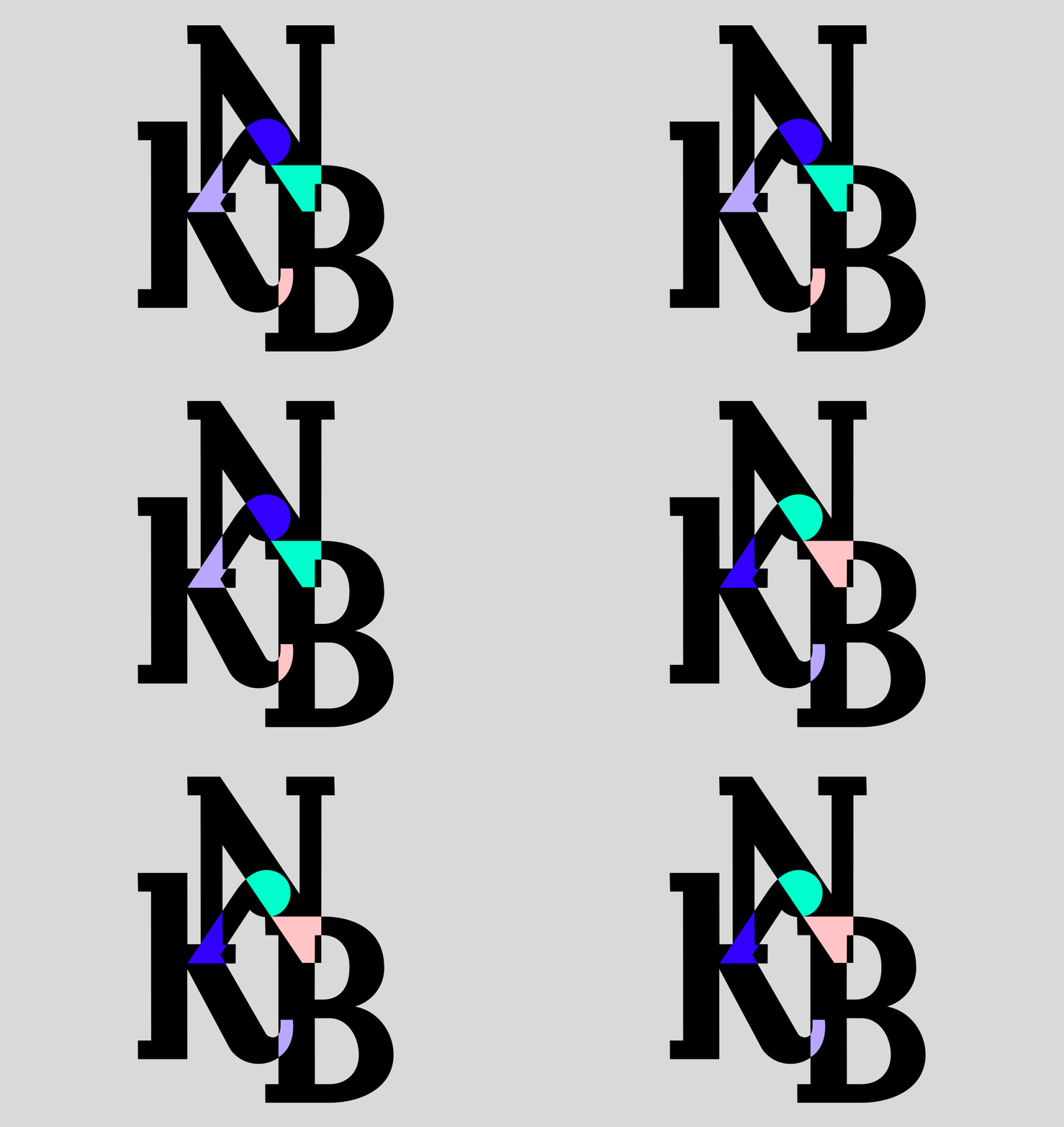
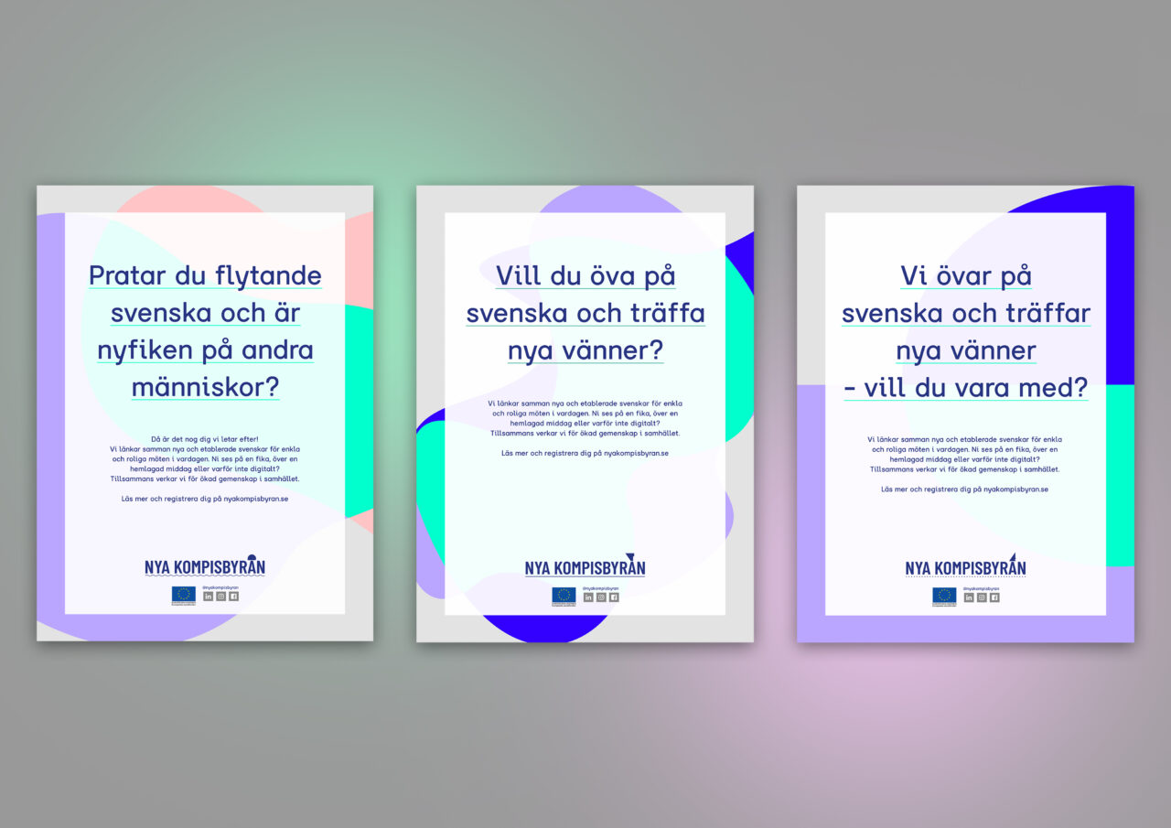
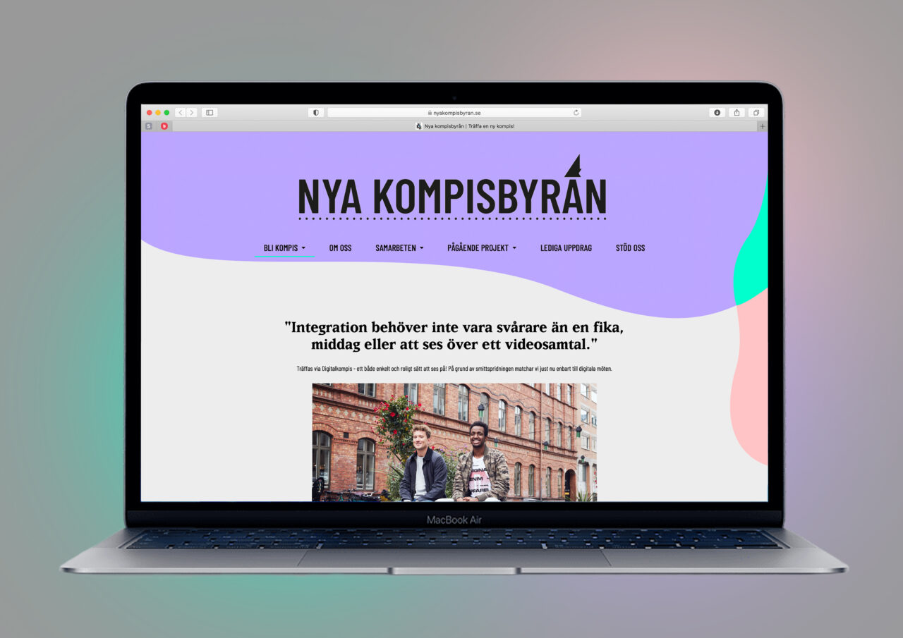
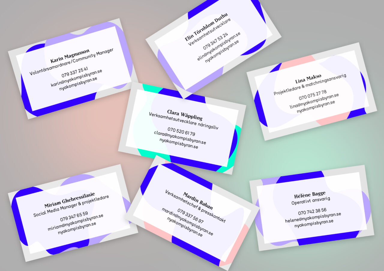
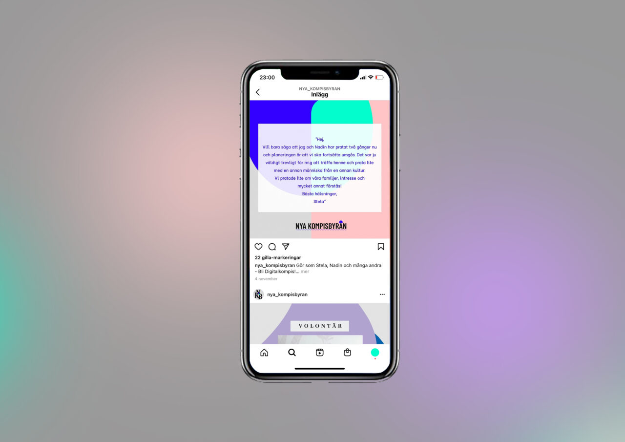
New visual identity for Nya Kompisbyrån (NKB). NKB’s activities enable integration through meetings of various kinds, and this is the starting point for the new visual identity. In other words, the shapes reflects meetings.
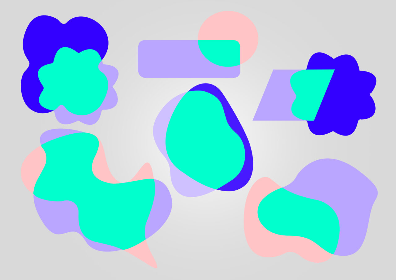
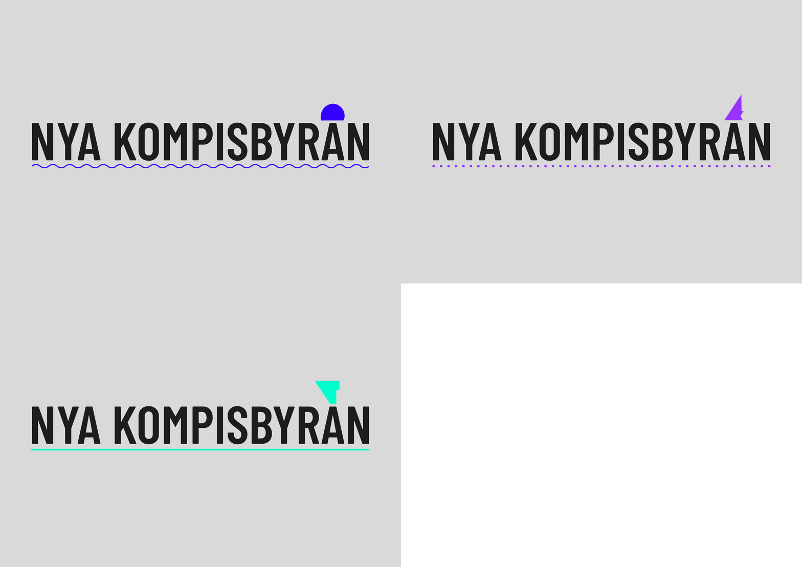
NKB’s activities enable integration through meetings of various kinds, which is the starting point for the new visual identity. Instead of showing physical people who meet, we have chosen to work with graphic shapes that represent the meeting. These shapes are inspired by Nya Kompisbyrån’s activities, areas such as sports, dinner-meetings, have a coffee together etc. We have, for example, taken shapes from cakes and sweets from Sweden but also from other parts of the world. Then we let these shapes meet and highlight/mark the areas where they merge. These imaginative shapes are then mixed with more abstract formations. The NKB logo also reflect meetings. The symbol highlights/marks the areas where the letters meet, the marking becomes the dot above the letter Å. A visual interpretation of Nya Kompisbyrån.
